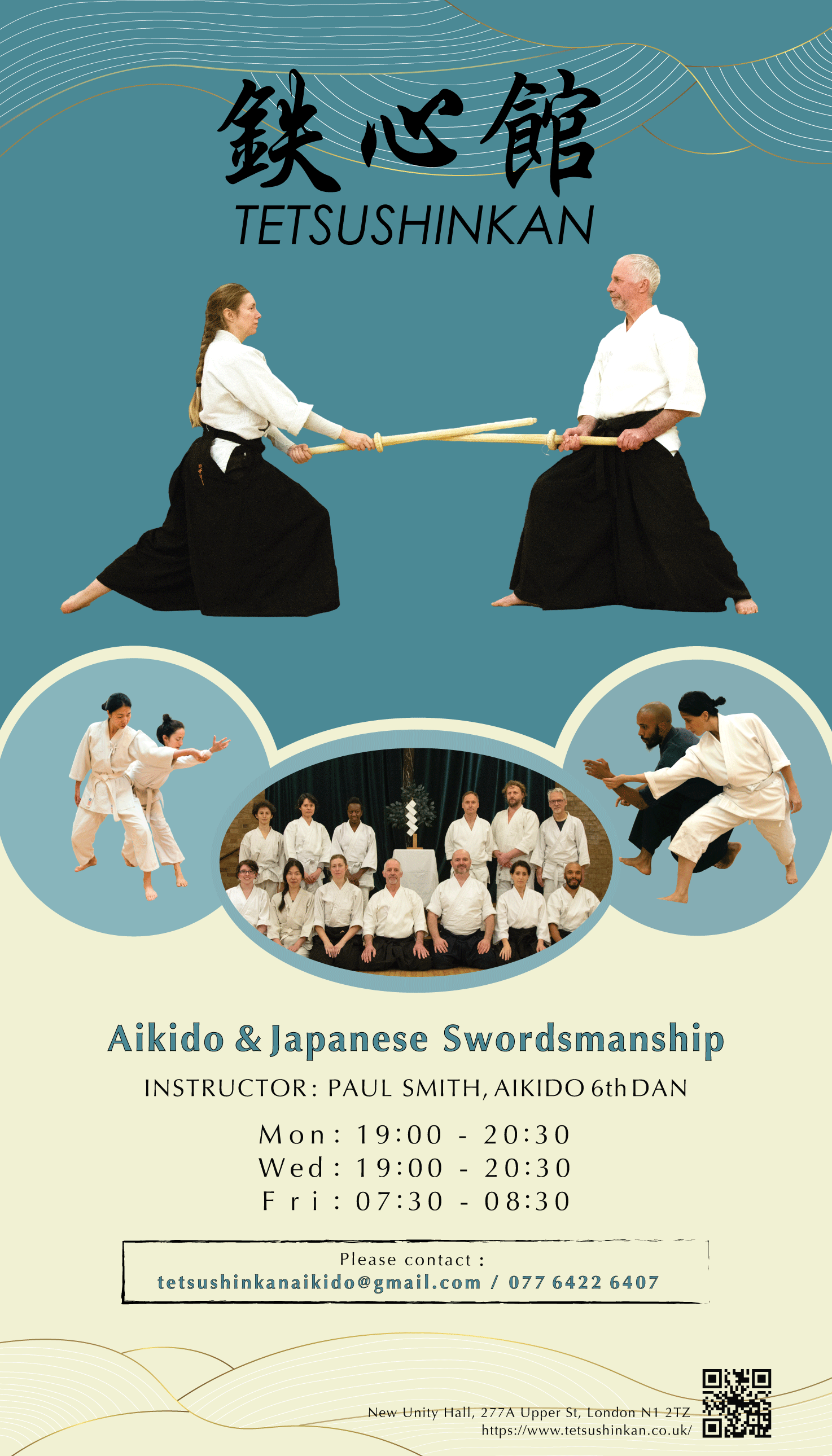
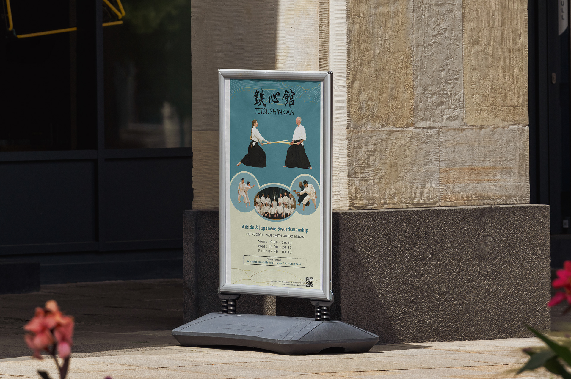
Overview
Designed a promotional poster for Tetsushinkan Aikido Dojo (Islington, London), advertising Aikido and Classical Japanese Swordsmanship classes for physical display outside the venue.
Brief & Challenge
The brief called for a design that communicates the dojo's schedule and contact information clearly, while capturing the spirit and atmosphere of Japanese martial arts. The challenge was to balance cultural authenticity, incorporating Japanese kanji typography, with the practical needs of a bilingual promotional piece accessible to a London audience.
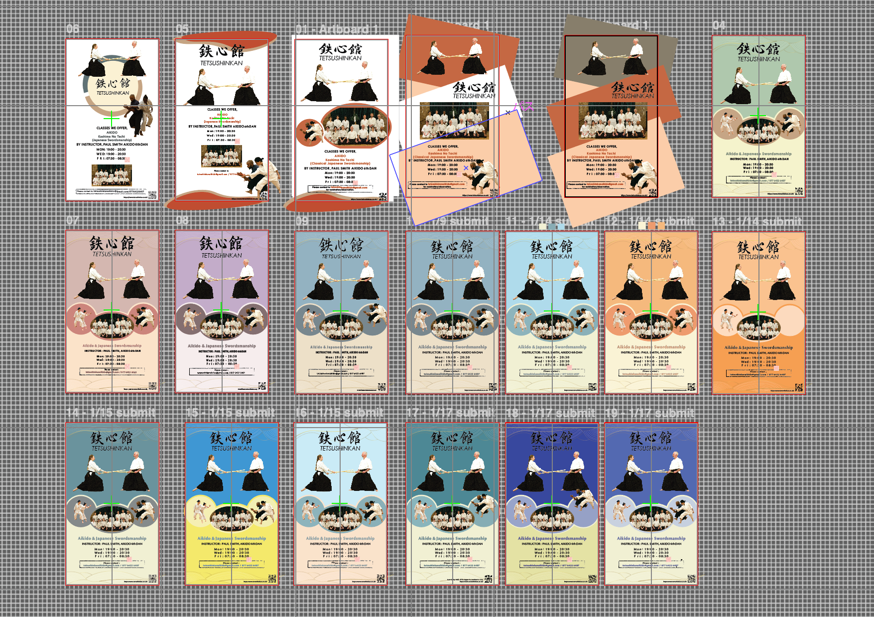
Process
The design went through an extensive iteration cycle, exploring over 19 colour palettes and layout variations ranging from warm terracotta and lavender to deep navy and orange. Each iteration was reviewed against readability, brand coherence, and cultural appropriateness. The final teal-and-cream direction was selected for its balance of boldness and approachability.
Design Concept
・Teal-blue background evokes calm, discipline, and the traditional dojo environment
・Traditional Japanese wave line motif adds cultural texture without being a decorative excess
・Large-format brushstroke kanji (鉄心館) anchors the poster's identity and creates an immediate visual hook
・Photography presented in circular frames, creating a warm, approachable feel while showcasing real students
・The cream lower panel clearly separates schedule information, ensuring legibility in outdoor conditions